Blinder-Oaxaca Decomposition in R
In this post, I will explain in simple terms the Blinder-Oaxaca decomposition and how to run it in R.
The two R libraries needed if you want to run the code are
  library(oaxaca)
  install.packages(oaxaca)
and for tidy outputs
  library(devtools)
  install_github("giacomovagni/oaxacad")
  library(oaxacad)
Learn more about the method here or here.
Introduction
The Blinder-Oaxaca decomposition (BO) is a method designed for decomposing gaps; health, wages, time-use, etc. The gap is decomposed into an “explained” part and an “unexplained” part.
The method is generally applied by comparing the gap between two groups, rich and poor, man and woman, young and old, etc.
Let’s take the example of height between rich and poor children. Let’s say that the average height of rich children is 70 cm, and the average height of poor children is 60 cm. The average gap is 10 cm.
Let’s call \(\bar{Y}_{A}\) the average outcome (height) for group A (rich) or group 1 and call \(\bar{Y}_{B}\) the average outcome for group B (poor). The difference is denoted by \(\Delta\) (delta).
\[\Delta \bar{Y} = \bar{Y}_{A} - \bar{Y}_{B}\]You identify the main factors responsible for this gap: nutrition, sleeping time, and exposure to pollution. Let’s call the sum of these factors \(X\).
You can think of two ways \(X\) is related to height (\(Y\)).
The first way is that rich children have better nutrition, more sleep, and less pollution exposure. Let’s say that having a high value in \(X\) means better nutrition, less pollution exposure, etc. Thus, we know that there is a positive relationship between \(X\) and \(Y\), as people with higher values in \(X\) (better nutrition, more sleep, etc.) also have higher values in height.
This is called “endowment” in the Oaxaca jargon.
This means that the two groups are different in their group characteristics. For instance, let’s imagine that rich kids have an average value of 20 for nutrition, sleep and pollution exposure (\(\bar{X}_{A} = 20\)), and poor kids have a value of 10 (\(\bar{X}_{B} = 10\)), which means here that rich kids have better nutrition, more sleep, etc. Rich kids are “endowed” with better resources or better “characteristics”.
Imagine that the effect of 1-unit of \({X}\) on \({Y}\) is 1-point (e.g. 1mm). In a regression framework, this denotes the coefficients, or \(\beta\). Let’s say that the intercepts for both groups are the same, at 50.
[rich children equation]
\[70 = 50 + 1 \times 20\] \[\bar{Y}_{A} = \alpha_{A} + \beta_{A}\bar{X}_{A}\][poor children equation]
\[60 = 50 + 1 \times 10\] \[\bar{Y}_{B} = \alpha_{B} + \beta_{B}\bar{X}_{B}\]This would look something like
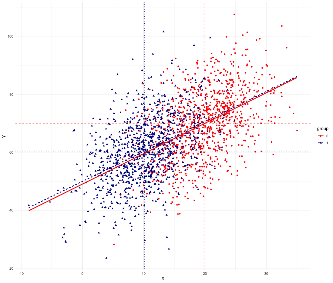
(red is rich kids, group 0 or A; blue is poor kids, group 1 or B)

The intercepts are the same, the slope of the regression line is the same for both groups, and only the average characteristics \(\bar{X}\) differ, with rich kids having higher values on \(X\). We can see this as the red dots, the rich kids, are higher on average on the horizontal axis.
What would happen if we gave the poor kids the resources of the rich kids?
In other words, we keep the intercepts and coefficients of the poor kids (\(\alpha_{B} + \beta_{B}\)) but we switch with the rich kids’ values (\(\beta_{B}\bar{X}_{A}\)).
[poor children equation with rich kids resources]
\[70 = 50 + 1 \times 20\] \[\bar{Y}_{B} = \alpha_{B} + \beta_{B}\bar{X}_{A}\]The gap would disappear completely! When the gap is completely reduced by plugging the characteristics of one group into the other group, we call this the “explained” part of the gap. The gap is purely compositional due to the resources or characteristics making up the groups.
The average gap is
\[70 - 60 = (50 + 1 \times 20) - (50 + 1 \times 10)\]10 points.
The “explained” (E) part of the gap is (from the point of view of group B)
\[\text{E} = \beta_{B} (\bar{X}_{A} - \bar{X}_{B})\]The percentage explained is simply Explained/Gap.
Here we have
\[10 = \underbrace{1}_{\beta_{B}} \times ( \underbrace{20-10}_{\bar{X}_{A} - \bar{X}_{B}} )\]Therefore, 10/10 = 1, 100% of the gap is explained by differences in characteristics or resources.
Note, however, that in certain cases, the reference group can influence the share of the gap explained. Picking one reference group instead of another can explain more or explain less of the gap.
I mentioned above that there is another way to think about how \({X}\) is related to height (\({Y}\)).
Imagine now that there is not only a difference in the characteristics or resources but also in the coefficients, \(\beta_{A}\), \(\beta_{B}\).
Imagine that the rich kids have higher coefficients (\(\beta_{A}\)) than the poor kids, such as 5.
\[\bar{Y}_{A} = \alpha_{A} + 5 \bar{X}_{A}\]The poor kids still have a beta of 1.
What does this mean? It means that even with the same characteristics, the rich give benefit more from the same resources. They have greater “returns” on the resources than poor kids. This could happen for many reasons. This could be due to unobserved factors. For instance, stress is not accounted for and plays a role in the quality of sleep. For the same amount of sleep time, the effect of sleep is less beneficial for poorer kids. The differences in the coefficients, or the size of the effects, are the “unexplained” part of the gap.
In the case of the wage gap between men and women, this unexplained part is interpreted as discrimination. For instance, if you have two individuals doing the same job in the same company with the same education, etc., but the man is paid more (i.e. the coefficients yield higher returns) than the woman, then these differences in the \(\beta\) can be interpreted as discrimination. However, we need to make sure to account for all factors, which is not always possible.
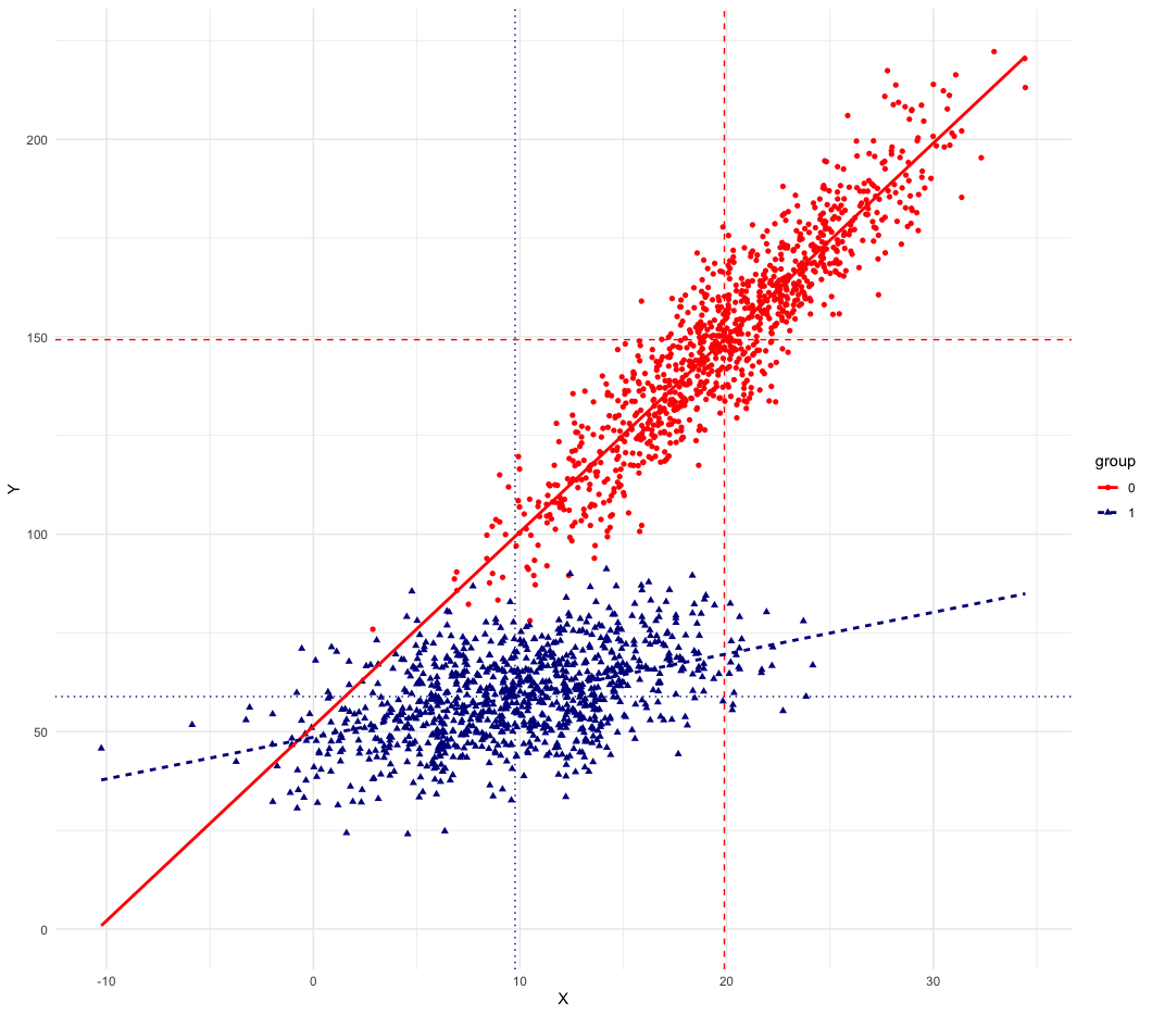
Going back to our example, we now have a gap of 90, which is 150 (i.e. the average outcome for group 1) minus 60 (i.e. the average outcome for group 2).
[rich kids]
\[\underbrace{50}_{\alpha_{A}} + \underbrace{5}_{\beta_{A}} \times \underbrace{20}_{\bar{X}_{A}} = 150\][poor kids]
\[50 + 1 \times 10 = 60\]The figure looks very different. The slopes are also different here.

We can still compute the “explained” part of the gap due to the characteristics or resources.
We have \(\bar{X}_{A} = 20\) for rich kids, and \(\bar{X}_{B} = 10\) for poor kids, with a difference in resources of 10, \(\beta_{B}(\bar{X}_{A} - \bar{X}_{B}) = 10\). (The coefficient for group B is \(\beta_{B}=1\))
With the \(\beta_{B}\) for poor kids of 1, we have \(1 \times 10 = 10 / 90 = 0.11\) or 11% of the gap explained by differences in observed characteristics.
In this example, the intercepts were the same; therefore, the “unexplained” part is due to the differences in coefficients.
Common Formalisation
The average gap is
\[\Delta Y = (\underbrace{\alpha_{A} + \beta_{A} \bar{X_A}}_{\text{eq for group A}}) - (\underbrace{\alpha_{B} + \beta_{B} \bar{X_B}}_{\text{eq for group B}})\]Can be re-written as (from the point of view of group B)
\[\Delta Y = (\alpha_{A} - \alpha_{B}) + \underbrace{\beta_{B}(\bar{X_A} - \bar{X_B})}_{\text{endowment}} + \underbrace{\bar{X}_B(\beta_{A} -\beta_{B})}_{\text{coefficient}} + (\bar{X}_A - \bar{X}_{B})(\beta_{A} - \beta_{B})\](from the point of view of group A)
\[\Delta Y = (\alpha_{B} - \alpha_{A}) + \beta_{A}(\bar{X}_{B} - \bar{X}_A) + \bar{X}_{A}(\beta_{B} -\beta_{A}) + (\bar{X_B} - \bar{X_A})(\beta_{B} - \beta_{A})\]Simulation in R
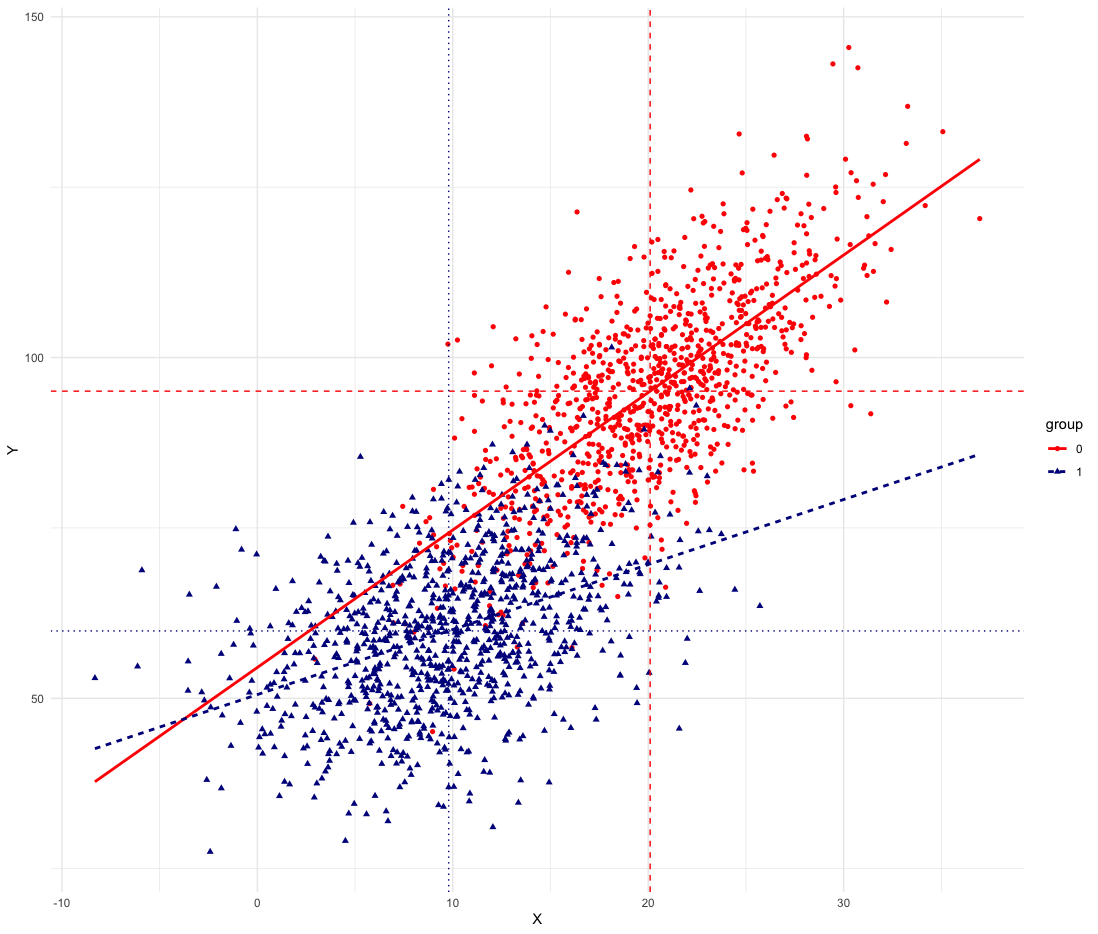
Let’s simulate an example. Group A has a higher intercept (55 vs 50 for group B), larger coefficients (beta = 2 vs beta = 1) and higher values for X (xA_avr = 20 vs xB_avr = 10 for group B). Group A is advantaged both in characteristics (X) and in the size, strength or returns in the coefficients and intercepts.

library(tidyverse)
library(broom)
library(gtools)

interceptA_avr = 55
interceptB_avr = 50
betaA = 2
betaB = 1
xA_avr = 20
xB_avr = 10
n=1000

# group A and B characteristics
XA = rnorm(n,mean = xA_avr, sd = 5) # you dont have to generate a normal distribution
XB = rnorm(n,mean = xB_avr, sd = 5) # you can just use the average xA_avr

# outcome for groups A and B
YA = interceptA_avr + betaA*XA # + rnorm(n)
YB = interceptB_avr + betaB*XB # + rnorm(n)

# GAP
mean(YA) - mean(YB)
35
# point of view of group B
(interceptA_avr-interceptB_avr) + betaB*(mean(XA)-mean(XB)) + mean(XB)*(betaA-betaB) + (mean(XA)-mean(XB))*(betaA-betaB)
35
# point of view of group B
(interceptB_avr-interceptA_avr) + betaA*(mean(XB)-mean(XA)) + mean(XA)*(betaB-betaA) + (mean(XB)-mean(XA))*(betaB-betaA)
-35
One thing to bear in mind is that the choice of reference group can change the % explained
betaB*(mean(XA)-mean(XB))
10/35

betaA*(mean(XB)-mean(XA))
-20/-35
We can check with the package oaxacad
  library(oaxaca)
  library(oaxacad)

oaxaca_sim(interceptA_avr = interceptA_avr, interceptB_avr = interceptB_avr,
       betaA = betaA, betaB = betaB, xA_avr = xA_avr, xB_avr = xB_avr)
oaxaca_sim(interceptA_avr =interceptB_avr , interceptB_avr = interceptA_avr,
       betaA = betaB, betaB = betaA, xA_avr = xB_avr, xB_avr = xA_avr)
Empirical Example in R
Let’s have a look at a simple example using the R swiss dataset, which provides fertility and socio-economic indicators for the 47 French-speaking provinces of Switzerland around 1888.
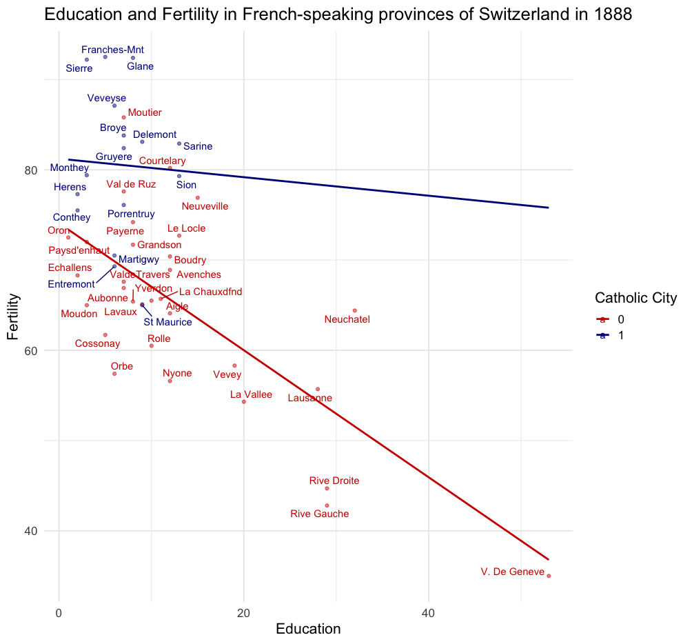
Let’s take Fertility as the outcome of interest (Y) and Education as the explanatory variable of interest (X). Let’s take as a group variable whether the city is a Catholic city or not (we define Catholic if more than 80% of people are Catholic).
Non-Catholic cities have, on average, a Fertility rate of 65.52% and Catholic cities have a fertility rate of 80%. The average gap is about 15%.
Fertility is on the y-axis, and Education is on the x-axis.

data(swiss)
swiss$catholic_city = ifelse(swiss$Catholic > 80, 1, 0)
swiss$name = rownames(swiss)

swiss %>%
  ggplot(aes(Education, Fertility, colour = as.factor(catholic_city), label =  name)) +
  geom_point(alpha = 0.5) +
  geom_smooth(method = "lm", se = F, fullrange = T) +
  geom_text_repel() +
  scale_color_manual("Catholic City", values = c('red3', 'blue4')) +
  theme_minimal(base_size = 16) + ggtitle("Education and Fertility in French-speaking provinces of Switzerland in 1888")


m0 = lm(Fertility ~ Education, data = swiss)
xt1 = cbind(expand_grid(Education = c(0,10,20,50)),
predicted = predict(m0, newdata = expand_grid(Education =  c(0,10,20,50))))
xt1
We see that there is a negative association between Education and Fertility. For each increase in education, fertility declines by about 8.6%.
\[\text{Fertility}_{i} = \alpha + \beta_{1} \text{Education}_{i} + \epsilon_{i}\]Let’s simulate the following predictions from a simple OLS model. If we have a city with 10% of the population beyond primary school, we predict a fertility rate of 70.99%. If we have a city with 50% of the population beyond primary school, we predict a fertility rate of 36%.
\[\begin{aligned}[ht] \begin{array}{rrr} \hline & \text{Education} & \text{predicted} \\ \hline 1 & 0.00 & 79.61 \\ 2 & 10.00 & 70.99 \\ 3 & 20.00 & 62.36 \\ 4 & 50.00 & 36.49 \\ \hline \end{array} \end{aligned}\]Now let’s run two separate regressions for Catholic and Non-Catholic cities.
First, we see that the intercepts are different. The Catholic cities have higher fertility at the onset. This will contribute to the unexplained part of the decomposition. Then we see that the regression coefficients are very different; the effect of education is stronger in Non-Catholic cities, at \(-0.70\). This difference in the coefficient will also play a part in the unexplained part of the decomposition.
m1 = lm(Fertility ~ Education, data = swiss, subset = catholic_city == 0 )
m2 = lm(Fertility ~ Education, data = swiss, subset = catholic_city == 1 )

data.frame(coef(m1), coef(m2))
Let’s look at the difference in characteristics between the two types of cities. Let’s only consider Education and the level of Agriculture between Catholic and Non-Catholic cities.
We can simply compute the average differences in these characteristics.
\[\begin{aligned}[ht] \begin{array}{rrrrr} \hline & catholic\_city & mean(Education) & mean(Agriculture) & mean(Fertility) \\ \hline 1 & 0.00 & 13.23 & 42.99 & 64.77 \\ 2 & 1.00 & 6.62 & 65.52 & 80.55 \\ \hline \end{array} \end{aligned}\] out_X = swiss %>%
group_by(catholic_city) %>%
summarise(mean(Education), mean(Agriculture), mean(Fertility))
We see that Non-Catholic cities have a higher share of the population that is educated beyond primary school, \(13\%\) versus \(6\%\) for Catholic cities. Non-Catholic cities are also less agricultural than Catholic cities, \(42\%\) versus \(65\%\).
We have a Fertility gap of \(15\%\) (\(80\% - 65\%\)).
How much is that gap due to observed characteristics such as education and agriculture?
Decomposing the Fertility Gap
The basic R command for the oaxaca decomposition is
  library(oaxaca)
  library(oaxacad)

  # let's reverse the scale of agriculture
  swiss$Agriculture_rev = rev(swiss$Agriculture)

  # the oaxaca decomposition
  ox = oaxaca(Fertility ~ Education + Agriculture_rev | catholic_city, data=swiss)

  # with the package oaxacad, we can retrieve the table below
  Decomp_Regression(ox)
\[\begin{aligned}[ht] \begin{array}{rlrrrrrrrrrrrrrr} \hline & & \beta_{1} & \beta_{1}(SE) & \beta_{1}(pv) & \beta_{2} & \beta_{2}(SE) & \beta_{2}(pv) & \beta_{1}-\beta_{2} & X_{1} & X_{2} & X_{1}-X_{2} & \Delta X \beta [\text{E}] & \Delta \beta X [\text{coef}] & \Delta \beta \Delta X & \sum (\text{gap}) \\ \hline 1 & (Intercept) & 80.38 & 4.89 & 0.00 & 87.70 & 6.30 & 0.00 & -7.33 & 1.00 & 1.00 & 0.00 & 0.00 & -7.33 & -0.00 & -7.33 \\ 2 & \text{Education} & -0.78 & 0.14 & 0.00 & -0.18 & 0.63 & 0.78 & -0.59 & 13.23 & 6.62 & 6.60 & -1.21 & -3.94 & -3.93 & -9.09 \\ 3 & \text{Agri/Urban} & -0.10 & 0.07 & 0.16 & -0.13 & 0.08 & 0.15 & 0.03 & 52.56 & 46.98 & 5.58 & -0.70 & 1.20 & 0.14 & 0.63 \\ 4 & \text{decomposition} & & & & & & & & & & & -1.92 & -10.07 & -3.79 & -15.78 \\ 5 & \text{decomposition} (\%) & & & & & & & & & & & 0.12 & 0.64 & 0.24 & 1.00 \\ \hline \end{array} \end{aligned}\]
\(\beta_{1}\) refers to the regression coefficients for group 1, the Non-Catholic cities, and \(\beta_{2}\) refers to the regression coefficients for group 2, the Catholic cities.
We have the stronger effect of education for group in \(\beta_{1} = -0.78\) than for group 2, \(\beta_{2} = -0.18\). The effect of agriculture is similar between groups (\(-10\) and \(-13\)).
The column \(\beta_{1} - \beta_{2}\) is the differences in coefficients.
\(\bar{X}_{1}\) and \(\bar{X}_{2}\) gives the average characteristics for group 1 and 2. I reversed the scale for the Agriculture variable, meaning the higher value, the higher the urban share.
Group 1, Non-Catholic cities, have, on average, higher educated people and higher urban share.
The column \(\bar{X}_{1} - \bar{X}_{2}\) is the differences in characteristics.
Threefold Decomposition
The average gap is composed in a traditional “threefold” decomposition of the Explained part \((X_{2} - X_{1}) \beta_{1}\), Unexplained part \((\beta_{2} - \beta_{1}) X_{1}\), and the Interaction (\(\Delta X \Delta \beta\)).
We saw this equation previously (for group B)
\[\Delta Y = (\alpha_{A} - \alpha_{B}) + \beta_{B}(\bar{X_B} - \bar{X_A}) + \bar{X}_B(\beta_{B} -\beta_{A}) + (\bar{X}_A - \bar{X}_{B})(\beta_{A} - \beta_{B})\]Which is the table is summarised like
\[\Delta Y = \Delta \alpha + \beta \Delta\bar{X} + \bar{X} \Delta \beta + \Delta \bar{X} \Delta\beta\] \[\Delta Y = A + E + C + I\]Intercepts plus Explained plus Coefficients and Interaction.
The share of the explained part is
\[\beta \Delta\bar{X} / \Delta Y\]\[\begin{aligned}[ht] \begin{array}{rlrrrrrrrrrrrrrr} \hline & & \beta_{1} & \beta_{1}(SE) & \beta_{1}(pv) & \beta_{2} & \beta_{2}(SE) & \beta_{2}(pv) & \beta_{1}-\beta_{2} & X_{1} & X_{2} & X_{1}-X_{2} & \Delta X \beta [\text{E}] & \Delta \beta X [\text{coef}] & \Delta \beta \Delta X & \sum (\text{gap}) \\ \hline 1 & (Intercept) & 80.38 & 4.89 & 0.00 & 87.70 & 6.30 & 0.00 & -7.33 & 1.00 & 1.00 & 0.00 & 0.00 & -7.33 & -0.00 & -7.33 \\ 2 & \text{Education} & -0.78 & 0.14 & 0.00 & -0.18 & 0.63 & 0.78 & -0.59 & 13.23 & 6.62 & 6.60 & -1.21 & -3.94 & -3.93 & -9.09 \\ 3 & \text{Agri/Urban} & -0.10 & 0.07 & 0.16 & -0.13 & 0.08 & 0.15 & 0.03 & 52.56 & 46.98 & 5.58 & -0.70 & 1.20 & 0.14 & 0.63 \\ 4 & \text{decomposition} & & & & & & & & & & & -1.92 & -10.07 & -3.79 & -15.78 \\ 5 & \text{decomposition} (\%) & & & & & & & & & & & 0.12 & 0.64 & 0.24 & 1.00 \\ \hline \end{array} \end{aligned}\]
We pick group 2 as the reference group, and we calculate the decomposition based on the table above.
The explained part is the sum of all the explanatory variables
(education)
\[(X_{1} - X{2}) \beta_{2} = ( 13.23-6.62 ) \times -0.18 = -1.21\](agriculture)
\[(X_{1} - X{2}) \beta_{2} = ( 52.56 - 46.98 ) \times -0.13 = -0.70\](sum)
\[-1.92 = -1.21 - 0.70\]which can be found on line 4 of the \(\Delta X \beta [\text{E}]\) column (11th column) of the table.
The total gap is \(-15.78\), which is given in the last column, in the row entitled “decomposition”
Therefore, \(-1.92 / -15.78 = 0.12\) or \(12\%\) of the gap in fertility between catholic and non-catholic cities is explained by the differences in characteristics or endowments.
This is shown in the last row of the table entitled “decomposition %”.
Counterfactuals
Note that the decomposition gives us counterfactuals.
For Catholic cities, we have 6.625% of the population with education and 46.981% of urban development.
The OLS equation for Catholic cities was
\[80.55 = 87.701 -0.184 \cdot 6.625 -0.126 \cdot 46.981\]This is
\[\bar{Y}_{B} = \alpha_{B} + \beta^{B}_{1}X^{B}_{1} + \beta^{B}_{2}X^{B}_{2}\]Now we can switch the values for agriculture and education for Catholic cities with the ones from Non-Catholic cities.
\[78.64 = 87.701 -0.184 \cdot 13.226 -0.126 \cdot 52.558\] \[\bar{Y}_{B}' = \alpha_{B} + \beta^{B}_{1}X^{A}_{1} + \beta^{B}_{2}X^{A}_{2}\]\(\bar{Y}_{B}' = 78.64 \%\) fertility is the counterfactual fertility if Catholic cities would have the characteristics of Non-Catholic cities
\[78.64 - 80.55 = -1.91\]This \(-1.91\) is the number we got from the column \(\Delta X \beta [\text{E}]\) and is the explained part of the gap.
If Catholic cities had had the same characteristics as Non-Catholic cities, they would have about \(2\%\) less fertility.
Decomposition and Regression
The Oaxaca decomposition is similar to a regression with an interaction between \(X\) and the groups (\(D\)).
\[Y = \alpha + D \ beta \bar{X}\] \[Y_{A} = \alpha_{A} + \beta_{A} \bar{X_A}\] \[Y_{B} = \alpha_{B} + \beta_{B} \bar{X_B}\]# R
m2 = lm(Fertility ~ catholic_city*Education, data = swiss)
ex = expand_grid(catholic_city = c(0, 1), Education = c(6,13))
cbind(ex, predicted = predict(m2, newdata = ex))
The predicted values from this regression shows the “counterfactual” values
\[\begin{aligned}[ht] \begin{array}{rrrr} \hline & \text{Catholic} & \text{Education} & \text{predicted} \\ \hline 1 & 0 & 6.00 & 69.86 \\ 2 & 0 & 13.00 & 64.93 \\ 3 & 1 & 6.00 & 80.61 \\ 4 & 1 & 13.00 & 79.90 \\ \hline \end{array} \end{aligned}\]\(80.61-79.90\) is the “explained part” of the Oaxaca decomposition.
We could develop a similar counterfactual notation will something along the lines
\[E[Y(B) \mid D = B] - E[Y'(B) \mid D = A]\]Limitations
Everything discussed above is predicated on the assumption that the regressions estimate the causal effect of \(X\) on \(Y\). If there is a confounder \(U\) causing both \(X\) and \(Y\), in a classic confounding fork \(X \leftarrow U \rightarrow Y\), then the idea of the “explained” part of the decomposition makes little sense, especially given the counterfactual nature of the decomposition.
Generally, in an effort to address all possible confounders (“closing the back-door paths”), researchers dump as many variables as possible into the decomposition. The issue is that, with cross-sectional data, this can create more bias (“collider”).
Playing with simulation with oaxacad
The package oaxacad provides a way to simulate Oaxaca Decomposition to test different specifications.
In oaxaca_sim, the user can set the intercepts, betas and X for group A and group B, and inspect the results.
oaxaca_sim(interceptA_avr = 100, interceptB_avr = 100,
  betaA = 5, betaB = 5,
  xA_avr = 10, xB_avr = 5)